Sunday, 19 June 2011

Artist Response Linked to Formal Elements


EXPERIMENTS

Experiments of Paper Relief's
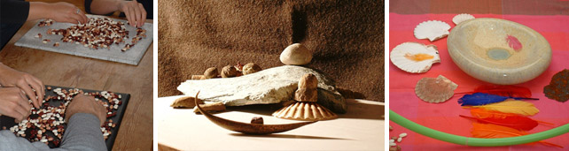
Using my primary sources to convey the process that Callesen does, I decided that instead of using the conventional paper, I used the actual object that was used, during my summer holiday


Peter Callesen Artist Research
My first impressions of peter Callesen is he worked almost exclusively with white paper in different objects, paper cuts, installations and performances. A large part of his work is made from A4 sheets of paper. It is probably the most common and consumed media used for carrying information today. This is why we rarely notice the actual materiality of the A4 paper. By taking away all the information and starting from scratch using the blank white A4 paper sheet for his creations.
 “I find the A4 sheet of paper interesting to work with, because it probably still is the most common and consumed media and format for carrying information today, and in that sense it is something very loaded. This means that we rarely notice the actual materiality of the A4 paper.

“I feel I have found a material that we are all able to relate to, and at the same time, the A4 paper sheet is neutral and open to fill with different meaning. The thin white paper gives the paper sculptures a frailty that underlines the tragic and romantic theme of my works”
The description of Peter Callesen work is unbelievable, how can it all be made out of paper, 3D, each detail of a tree or a person is exactly as it is, no room for errors, it’s almost like the paper is alive and moveable, its white paper, but some of his work he has to incorporate colour. For example, blood, water etc. Some of his paperwork has a meaning that has directly happened or happening, or to create a fictional world.
The paper cut sculptures explore the probable and magical transformation of the flat sheet of paper into figures that expand into the space surrounding them. The negative and absent 2 dimensional space left by the cut, points out the contrast to the 3 dimensional reality it creates, even though the figures still stick to their origin without the possibility of escaping.
The formal elements that Callesen used are composition, patter, shape and form. In his use of composition he made sure that most of the
Background information on Callesen:
·         Born in 1967 in Demark
·         Education:
  1997-00 Goldsmiths College, London
 1994-97 Det Jyske Kunstakademi, Århus
 1993-94 Århus Art School (Foundation Course)
 1990-93 Århus School of Architecture
·         He has a number of self and grouped exhibition which included,  1998
(The Dying swan, performance at Goldsmiths College's exhibition)
·         From his first exhibition, he has continued to be attracted into different countries for his amazing work. for example, Copenhagen, New York, Denmark and Berlin
·         As many people think he only uses paper, but he uses other mediums to produce intricate installations, that are grouped.
Analysis of the Callesen’s exhibitions and paper work 
One of the most exciting exhibitions that Callesen did he served a luxurious lunch for everyone attending the show. The room was green-painted all over except for a white quadrangle on 208 x 264 cm, which correspond to the size of the famous painting, Le Dejeuner sur l'herbe by Edward Manet.
A white-chequered cloth on the green imitation lawn I had placed the lunch as if it had fallen out of the picture - the immaterial had become material.
 At the opening, he taped the sound of people drinking, eating and talking. After the opening, he emptied and cleaned the gallery for all the food. The only thing left from the happening was the sound, which you now could listen to in a pair of headphones hanging opposite the white "picture".
 The message for this exhibition is that about imagination and about making pictures. However, it is also an ironic comment on the importance of attending the opening of a show. Often the opening event becomes more important the art. Here literally, but not artistically.


 Large scale Paperwork
Three Angels Trying to Escape Their Drawing, 2007
Callesen's ability to create a story with simple sheets of paper inspires me to find art in everyday things. These large cut paper cut installations are particularly amazing because they explore the relationship between imagination and reality, between a beautiful and calm two-dimensional world and a frighteningly scary three-dimensional one. The paper cuts are small dramas in which small figures are lost within and threatened by the huge powerful nature. Others again are turning the inside out, or letting the front and the back of the paper meet – dealing with impossibility, illusions, and reflections.
In his paper works, Peter Callesen demonstrates that the flatness of paper can rise into a living three-dimensional picture. The pictures he creates out of paper are multi-dimensional in the sense that there is both a positive and a negative form, in which the silhouette, the absent picture, is often the most intense expression.
“By removing all the information and starting from scratch using the blank white 80gms A4 paper as a base for my creations, I feel that I have found a material which, on one hand, we all are able to relate to, and which on the other hand is non-loaded and neutral and therefore easier to fill with different meanings. The thin white paper gives at the same time the paper sculptures a fragility which underlines the tragic and romantic theme of the works.”


Here is a video of Peter Callesen briefly explaining what he does and how how does it 

Saturday, 18 June 2011

In- Depth Response to Chosen Artists of Photography and Sculpture

Sue Mayo

Sue is a theatre maker, facilitator, teacher and consultant. Working across art forms, often in collaboration with other artists, Sue has created and facilitated a wide range of creative projects in the UK and beyond. Sue lectures at Goldsmith’s College, University of London, where she is Associate tutor on the MA in Applied Drama, and is Associate Artist at Magic Me, the UK’s leading intergenerational arts provider.  Sue works in the professional development of artists who want to work in education and community settings, and acts as a consultant and evaluator for arts and heritage organizations.


Settlements project imagesWork in Progress:
Settlements is an ongoing exploration of the making of place and the inhabiting of space, through the creation of tiny worlds, using found objects.  Building on a series of structured exercises, Sue continues to explore and develop this way of working, most recently working with young artists to develop the work through film.  In preparation are family workshops with Settlements that lead to collective storytelling, and work with dancers to explore using the body as the site of the installations.
ResearchSue is under Commission from Methuen Drama to write two chapters for a new publication on Theatre and Community. She is writing about Magic Me’s intergenerational performance projects at Queen Mary College, and about the work of artist Mark Storor and Participation Producer Anna Ledgard
In 2012 Sue will be working with Magic Me on their new collaboration with Duckie. She will be researching and documenting the different was in which a variety of art forms support the building or relationships in a group.
http://www.duckie.co.uk/
Background Information
Sue has taught at Rose Bruford, South Bank Theatre School, Queen Mary College, and currently atGoldsmith’s College. Sue taught for three years on Flight Paths, the training programme for artists from refugee communities wanting to work in Schools in the UK. She contributes regularly to the continuing professional development programme run by Magic Me, and has led training at Glyndebourne, for theGeffrye Museum, and for the National Trust.
Sue has mentored artists from many arts organizations, and has been on the Board of Leap Theatre Workshop, and Trestle Theatre Company. She is currently on the Board of Talawa Theatre
I decided to chose Sue Mayo as she currently finds new ways to archive information together, this includes putting information together that has been kept for a long time, as we showcased this at the Goldmsiths. As she is one of my chosen artist who relates to my theme travel and the summer box that we had and how we can make that into a form of art.

Sue Mayo- Sue is our lead artist on the project. Since 2008 she has been developing innovative participatory work for the LIFT Living Archive, exploring ways of bringing to life the collection with educational and community groups. Sue is a theatre maker and community artist with 30 years of experience and endless energy. By bringing together different art forms she enables diverse community groups to create their own work; writing, performance, visual practice or site-specific work What Sue says about the project?"The work that the participants discover through the archive opens their eyes to new ways of working, and making performance. It has been exciting for us as artists to use different shows from the LIFT archive in each school, and to develop completely different pieces in each place."


William Coupon


http://slides.sitewelder.com/users/WilliamCoupon717/images/WilliamCoupon71743536.jpg  His first photographs were photographs that talked – called "audio graphs" – which were photographs that had looped cassettes behind a framed image, and photographs that moved – called "kinetographs" – which were photographs that were attached to moving motors. The "kinetographs" were commissioned for window displays at Bloomingdale’s in the late l970’s. I photographed a documentary on Studio 54, the legendary New York disco, in late summer l978, and they immediately were included in the International Centre of Photography exhibition: "Fleeting Gestures: Treasures of Dance Photography."

He became interested in formal studio portraits in 1979 while observing it’s lower Manhattan youth (my peers) and its present counter-culture, and decided early on to use a single-light source and simple mottled backdrop, and when he needed to, he would set this up as a portable studio, one highly mobile. This was then used to document global sub-cultures. Many of the projects – referred to as "Social Studies" – became documents of indigenous people. These include projects on Haiti, Australian Aboriginals, Native Americans, Scandinavian Laplanders, Israeli Druzim, Moroccan Berbers, Alaskan Yupik, Spanish Gypsies, Turkish Kurds, Central African Pygmy, and Panamanian Cuna and Chocoe. These projects also included Death Row Inmates, Drag Queens, and Cowboys. Stylistically, they were always photographed formally on the backdrop, and contextually, or environmentally, with 2 1/4 Rolleiflex black and white images, which were meant to be companions to the studio portraits.


Phil Borges
http://www.philborges.com/collections.html 

For over twenty five years Phil Borges has lived with and documented indigenous and tribal cultures around the world. Through his work, he strives to create a heightened understanding of the issues faced by people in the developing world.
Through his exhibits and award-winning books, Phil attempts to create a relationship between the audience and his photographic subjects. “I want the viewer to see these people as individuals, to know their names and a bit of their history, not just to view them as an anonymous part of some remote ethnic or tribal group.” 
His book TIBETAN PORTRAIT: The Power of Compassion, introduces individuals from a deeply spiritual culture who have been marginalized and displaced by the occupation of their homeland. In 1998 he joined Amnesty International to present ENDURING SPIRIT, an exhibit and book celebrating the fiftieth anniversary of the Universal Declaration of Human Rights. His exhibit and book The Gift highlights the work of medical teams that provide facial reconstructive surgery to children in the developing world.
In 2004 Phil began an ongoing project to highlight the oppression and discrimination women and girls still face in the developing world.  Phil worked with the organization CARE to release the book and exhibition titled Women Empowered in 2006.  Phil's most recent exhibition addressing gender issues is titledStirring The Fire: a global movement toward gender equality.  The exhibition and companion website is designed to bridge the gap between awareness and action. Central to the project is the Call to Actionwith its searchable database of organizations and resources intended to provide specific opportunities for those wanting to help women and girls achieve social and economic justice worldwide.
Phil has hosted three television documentaries for Discovery and National Geographic as a part of a series that investigates indigenous cultures that still maintain a spiritual dialogue with the natural world. 
Phil’s photographs are collected and exhibited in museums and galleries worldwide. His award-winning books have been published in four languages and in 1998 he was presented the Photo Media Magazine "Photoperson of the Year" award. In December, 2003 Phil was honored with the Humanitarian Award, receiving the Lucie at the 1st Annual International Photography Awards. In 2005 he was named a Giraffe Hero for his humanitarian work. Phil teaches and lectures internationally and is co-founder of Blue Earth Alliance, a 501c3 that sponsors photographic projects focusing on endangered cultures and threatened environments.


Elinor Carucci

She was born in Jerusalem where she served in the Israeli Army for two years from 1989–1991, and received her BFA from the Bezalel Academy of Arts and Design in 1995. She lives and works in New York City and is a member of the Faculty in Photography at the School of Visual Arts in New York. She has also taught at Princeton University and has been a visiting lecturer at Harvard University.
Since her gallery debut in 1997, Carucci's has had solo exhibitions in London, Frankfurt, Prague and Jerusalem. Her work has been extensively published and collected by numerous institutions and private collectors. She has been included in group and solo exhibitions at Edwynn Houk Gallery,Fifty One Fine Art Gallery, Gagosian Gallery, Museum of Modern Art, New York and The Photographers' Gallery, London to name a few. Her work has been featured in The New York Times Magazine, which included an eight page portfolio of work published in 2005, W, The New Yorker, Aperture,ARTnews, and Details among many others. Collections she has been featured in include, The Museum of Modern Art, New York, the Jewish Museum, New York, International Center of Photography, the Brooklyn Museum of Arts, the Houston Museum of Fine Arts, The Museum of Israeli Art Ramat Gan, Herzlia Museum of Contemporary Art, and the Haifa Museum of Art.
She is currently working on a body of work about her children and motherhood. Other prominent bodies of work include, Closer, which was monographed in 2002 by Chronicle Books and Diary of a Dancer, which was monographed by SteidlMack in 2005, as well as, Pain, Crisis, and Comfort. Closer's second edition was published with a forward by The Museum of Modern Art's curator for photography, Susan Kismaric in 2009.
I have chosen this photography artist as they all have a cohesive theme throughout their pictures, as they all work through themes, I have specifically chosen potrait and people who all work in black and white in conjunction to the cliche verre experiments which would be great onto my background on my installation.

Spices Artist
CHOKRA (Conscious Hoarding Of Kinetic Rage Associated) is an artist from United Arab Emirates, who uses pigment, smoke, scent, spices and powdered chilies to create mesmerizing performances that emphasize ritual and drama.
His pyrotechnic performances use multilingual rhythms set in Arabic, Urdu, Hindi and English. CHOKRA also explores trans-gender identity using sound animation, video and transnational costumes. His work is an incarnation of the cross-cultural and multi-ethnic potpourri feeding the construction boom in UAE, with immigrants bringing cultural contributions from the Indian subcontinent. The surge of art-traffic in connection with the Dubai art fair, and museums sprouting in Abu Dhabi increases the creative dynamic and encourages dialogue for Arab artists in the US.


http://vimeo.com/22540196 This video shows how they used different types of elements into their perfomance/ installation.


Amy Thompson sculpture artist

Amy Thompson is a concept led designer who seeks to explore the unknown, achieve the unexpected, challenge the existing and create the extraordinary. Both her obsessive research and creative experimentation direct and shape each piece she designs, often using sculptural methods to exaggerate and manipulate silhouette and scale in order to discover the overall effect desired. Innovation in her work is also achieved by the fusion of contemporary and traditional techniques, the cross over into non-fashion disciplines and use of unconventional materials. In addition, quirky printed textiles play an important part in her designs and bring a fresh and distinctive individuality to her work.

Collaboration with design duo Talbot Runhof for their A/W 10 showcase at Paris Fashion Week. The collection is based on the Hans Christian Andersen fairy tale, "The Red Shoes". A fable of relentless obsession, paralyzing danger and unyielding seduction. Plastic accessories designed and made by Amy Thompson, including leg, chest and neck pieces as well as gloves and sculptural shoulder armour.

My first impressions of the artwork is that it is very innovative and new mixing fashion and body amour I loved the idea of creating it to match the outfit. The materials that where used are also malleable and can be moved as the model walks, so aesthetically it joins and moves with the body perfectly.   

After completing a number of test pieces from my modroc which can be viewed at the final evaluation, derived from this.

Finally, coming to the idea molding me and creating a number of pieces that would showcase memories of smell as it was the most prominent aspect of my summer. Also deriving the characteristics of sight looking around at the people I love.

Friday, 17 June 2011

Final Outcome and Evaluation

Final Evaluation


In creating my outcome, I had to convey the theme of memories. My intended outcome for this project is a window display that would show one of the different types of the 5 senses which I think where prominent in my summer and how overtime they changed from being kept in a box.  Also showing me as the centre of the piece.

My client who was chestnut grove school commissioned me to create a window installation, which would display my summer as an artist and displaying it. The artist from the LIFT project did influence, as working with these artists was useful as it was good to get out of the learning environment and explore more opportunities that can be done with art. For example, Dan helped us to convey sound through the windows, using T.V’s and CCTV. Sue helped us with the performance side of it, of how we would convey ‘our’ archives. The artist also taught as valuable lesson to teach, for example, Eddie who was more rounded and was experienced in both fields, working with sound and performances. His work now, linked in with ours as he was archiving a project called promised lands that related to the Bible references.

In creating my experiment, I looked at a range of other artists. Of which my main artist I decided to link my outcome to Phil Borges who lived and travelled and documented indigenous and tribal cultures around the world. Through his work, he strives to create a heightened understanding of the issues faced by people in the developing world. I applied this into my outcome by using the photographs from my summer of people that I lived and travelled with. Using a different artist for type of photo that were taken I decided to use Elinor Carucci for her portraits of pictures that were used with different themes.

I have chosen this photography artist as they all have a cohesive theme throughout their pictures, as they all work through themes, I have specifically chosen portrait and people who all work in black and white in conjunction to the cliché Verre experiments which would be great onto my background on my installation.   

The experiments that I used where mark marking for the layering onto the body parts and placing the spices that I smelt and. As for the cliché Verre, this is used to create a copy of black and white portraits that derived from my main artists.  As mod roc was my main experiment, this had many constraints, as it required labour of patience. For example, a piece might break because of not enough drying time, or not enough moisture, as this was the main focus it had to be executed well.  

Secondly, for the body parts these where created for my body parts. This concept came I used from Amy Thompson, both her obsessive research and creative experimentation direct and shape each piece she designs, often using sculptural methods to exaggerate and manipulate silhouette and scale in order to discover the overall effect desired.

Using experience from the Lift artists and project to create a space were work was made in layers, that could include paintings, drawings, video, photography and performance. To follow in the footsteps of the performers of the Urban Dream Capsule we created a space inside the window where we would call it ours, using a mixture of personal objects, using a ray of other artists.

Lastly, as time came to display the hanging body another constraint as the first idea as to hang it as support was the biggest problem, as these body parts are delicate. Therefore, I decided to abandon the idea, but make the body parts sit, as you would be travelling.  

Overall, I think my outcome was a success as I was able to create an space that was filled with the greatest sense smell and sight which can take you back to any memory with or without people. I also think it met my aims of showing my summer holiday using a range of techniques I developed through experiments.  However, I would of like to include more aspects of my summer of the prints I created through an outfit or scarf of the prints, colours etc.

Preparation for the window installation:

The theme of this project is archiving memories within your summer box, how are you going to convey your summer within an installation? I asked myself. First thought was I needed to narrow it down. The sub-theme I came up with is Travel. This came about as I did a lot of travelling through the summer.
Each part of the installation, symbolizes the body as being pupperted through the summer. The train track, the background pictures as the people that I was consitantly surrounded with and the spices that where coated within, to represent the food, and the vibe that was throughout my summer. The prep for the exam started with me constructing mod roc model's of my hands, feet, shoulders and face. This continued on to a train track   As this, was to represent me within the summer
 Mod roc (Hands, Face, feet, shoulders)


The making of the train track and dyeing


Dye


Installation Day:
The day of the exhibition was stressful, cause I had so many little compartments that needed to be filled and sewed. Firstly, I wanted to re-create the smell of my summer that was filled with spices and perfumes. The hands, shoulders, and feet where carefully placed with each clove, garam masala, tumeric and cardamons. This symbolized the air that was constantly filled.